If you’ve ever glanced at a car and noticed the sleek, modern emblem on its front, you’ve probably wondered about the Kia symbol meaning. It’s one of those logos that feels simple at first—but the more you look, the more questions it raises.
Is it just a stylized name? Does it represent something deeper? And why did it change so dramatically in recent years?
People search for the Kia symbol meaning because the logo doesn’t just identify a car brand—it reflects identity, innovation, and a shift in how we see modern vehicles. The latest design especially sparked curiosity, confusion, and even debate online.
In this guide, we’ll break it all down in a way that actually makes sense—no fluff, no jargon. Just clear insight into what the Kia logo really means and why it matters more than you think.
Kia Symbol Meaning – Quick Meaning
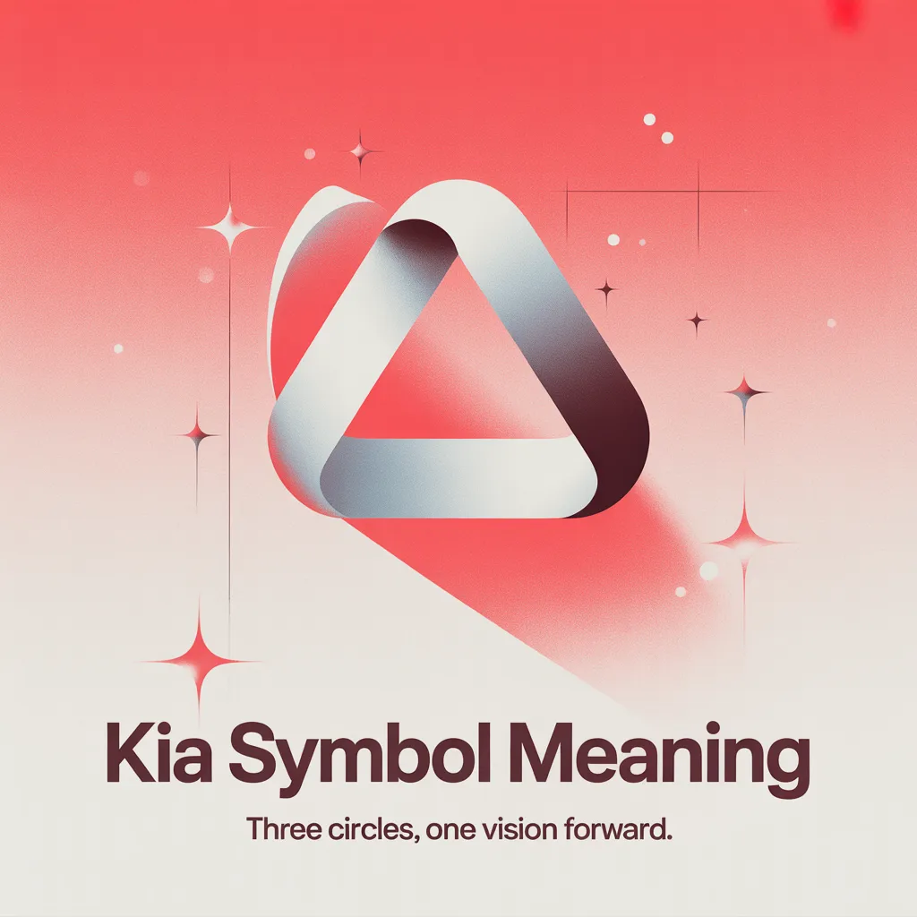
At its core, the Kia symbol represents movement, innovation, and forward-thinking design.
Here’s the meaning in simple terms:
- Kia = “Rising from Asia” (derived from Korean roots)
- The modern logo symbolizes:
- Progress without limits
- Sleek innovation
- Breaking traditional boundaries
Quick examples in real-life usage:
“I didn’t even recognize it was Kia—the new logo looks futuristic.”
“That Kia badge actually looks premium now.”
“Wait… that says Kia? I thought it was KN!”
Origin & Background
The story of the Kia symbol begins long before the modern logo.
Kia was founded in South Korea in 1944. The name itself comes from two Chinese-Korean characters:
- “Ki” (起) meaning “to rise”
- “A” (亞) referring to Asia
So, the literal interpretation becomes “Rising from Asia.”
Early Logo Phase
Originally, the Kia logo featured a more traditional oval shape with bold lettering. It was practical—but not particularly memorable.
The Big Shift
Everything changed in 2021.
Kia unveiled a completely redesigned logo:
- No oval
- No spacing between letters
- A connected, flowing design
This wasn’t just a visual update. It marked a brand transformation—from a budget-friendly carmaker to a bold, design-driven global brand.
Social Media Impact
The new logo went viral almost instantly.
Many people thought it read “KN” instead of Kia. That confusion actually boosted visibility, sparking memes, debates, and curiosity.
Ironically, what looked like a misunderstanding became one of the most successful rebranding moments in recent automotive history.
Real-Life Conversations
Here’s how the Kia symbol meaning naturally shows up in everyday chats:
WhatsApp Chat
Person A:
Did you see that new Kia car?
Person B:
Yeah but what’s with the logo? Looks like KN 😭
Person A:
It’s Kia… they changed it to look more modern.
Instagram DMs
Person A:
That logo actually looks expensive now.
Person B:
Exactly! Kia upgraded their whole vibe.
TikTok Comments
User1:
I thought it was a new brand 💀
User2:
Same, didn’t realize it was Kia until someone told me
Text Messages
Friend 1:
Thinking of buying a Kia.
Friend 2:
Bro they’re not the same anymore. New logo, new cars 🔥
Emotional & Psychological Meaning
Logos aren’t just design—they trigger emotion.
The Kia symbol taps into something subtle but powerful:
- Confidence – Clean, sharp lines feel bold
- Curiosity – The “KN effect” makes people look twice
- Modern identity – It aligns with futuristic thinking
People use or notice the Kia symbol because it feels like change.
Personal Scenario
Imagine you’re standing in a parking lot.
You see two cars:
- One with a traditional badge
- One with the sleek new Kia symbol
Without realizing it, your brain leans toward the second one. It feels newer, smarter, more intentional.
That’s not an accident. That’s design psychology.
Usage in Different Contexts
Social Media
People talk about the Kia symbol when:
- Reacting to the new design
- Comparing old vs new branding
- Making memes about “KN”
Friends & Relationships
Among friends, it often signals:
- Taste in cars
- Awareness of trends
- Personal style preferences
Work / Professional Settings
In professional conversations, the Kia symbol represents:
- Brand evolution
- Market repositioning
- Design innovation
Casual vs Serious Tone
- Casual: “That logo looks sick”
- Serious: “Kia’s rebranding reflects a strategic shift toward premium perception”
When NOT to Use It
Even something as simple as a logo has context.
Avoid overusing or misinterpreting the Kia symbol meaning in:
- Formal presentations without understanding its branding context
- Cultural discussions where deeper symbolism matters
- Technical conversations where branding isn’t relevant
Also, don’t assume everyone understands the new logo—especially older audiences.
Common Misunderstandings
Here’s what people often get wrong:
- “It says KN”
→ It’s still Kia—just stylized differently - “It’s a new company”
→ Same brand, new identity - “It’s just a design change”
→ It reflects a full strategic shift - “It has no meaning”
→ It symbolizes innovation and movement
Comparison Table
| Expression | Meaning | Tone | Usage Context |
|---|---|---|---|
| Kia Symbol | Innovation, progress | Modern | Automotive branding |
| Old Kia Logo | Simplicity, reliability | Neutral | Past identity |
| Tesla Logo | Futuristic tech | Premium | Electric innovation |
| Toyota Logo | Trust & legacy | Stable | Global reliability |
| Opposite Idea | Outdated branding | Negative | Old perception |
Key Insight:
The new Kia symbol isn’t just about looking different—it’s about feeling different. It shifts perception from “affordable” to “aspirational.”
How to Respond When Someone Uses It
Casual Replies
- “Yeah, it actually looks pretty cool now”
- “Way better than the old one”
Funny Replies
- “Still reads like KN to me 😂”
- “I thought it was a new brand ngl”
Mature Replies
- “It’s a smart rebranding move”
- “They’re clearly targeting a premium market now”
Respectful Replies
- “It reflects their new direction”
- “Interesting how design changes perception”
Regional & Cultural Usage
Western Culture
Seen as a bold rebrand. Many appreciate the modern, minimalist aesthetic.
Asian Culture
Carries deeper meaning due to its linguistic roots—“rising from Asia” still resonates strongly.
Middle Eastern Culture
Often associated with value + growing prestige.
Global Internet Usage
The “KN confusion” made it globally recognizable almost overnight.
Generational Differences
- Gen Z: Finds it trendy and meme-worthy
- Millennials: Appreciates the brand evolution
- Older Generations: Sometimes confused by the change
Is It Safe for Kids?
Yes—completely.
The Kia symbol has no inappropriate meaning. It’s simply a brand logo representing innovation and growth.
The only confusion kids might have is reading it as “KN”—which is harmless and even a bit fun.
FAQs
1. What does the Kia symbol actually mean?
It represents innovation, movement, and the idea of rising from Asia.
2. Why does the new Kia logo look like KN?
The connected letter design creates that illusion, but it still spells Kia.
3. When did Kia change its logo?
The major redesign was introduced in 2021.
4. Is the new logo better than the old one?
Design-wise, it’s more modern and aligns with current branding trends.
5. Does the logo have a hidden meaning?
Yes—it reflects a shift toward futuristic and premium positioning.
6. Why do people talk about it so much?
Because it’s visually confusing at first, which sparks curiosity.
7. Is Kia trying to rebrand itself?
Yes, the new symbol is part of a larger transformation strategy.
Conclusion
The Kia symbol meaning goes far beyond a simple logo.
It tells a story—of growth, ambition, and a brand that refused to stay the same.
What makes it interesting isn’t just the design. It’s the reaction it creates. The double-take. The confusion. The curiosity.
That’s what great branding does—it makes you feel something.
So the next time you see that sleek emblem, you’ll know exactly what it stands for. Not just a car company—but a mindset that’s always moving forward.
descover more post
Chevrolet Symbol Meaning The Hidden Story Behind the …
Bull Symbol Meaning What It Really Represents in Text …
Heart Symbol Spiritual Meaning What It Really Says About …

Kavon is a passionate content creator and digital researcher who specializes in decoding symbols, meanings, and modern internet language. With a strong focus on clarity and authenticity, Kavon writes in a way that makes complex ideas simple, relatable, and useful for everyday readers.
Known for a hardworking mindset and attention to detail, Kavon is dedicated to creating content that genuinely helps people understand the deeper meanings behind words, signs, and online expressions. Every article is crafted with care, combining research, real-life insight, and a reader-first approach.
Through Symblpedia, Kavon aims to build a trusted space where curiosity meets clarity—helping users find answers that are not only accurate but also meaningful and easy to understa